Exploring the world's countries
At Our World in Data, we talk about major global problems, how they affect people, and how we can solve them. But the lens we use is countries.
This is because, fortunately, country borders have been relatively stable since World War II, and countries are the primary unit of international cooperation and comparison.
The number of countries is large but manageable enough to keep track of them all and compare them on a range of indicators. Tracking a limited number of things is important for a small team trying to do good.
A major challenge when communicating about countries is to bring them to life and put them in context. Last April I built a country explorer to help with this, and after some time it’s interesting to share what I learned.
The impatient can stop reading and try it out here.
A solid intro
In order to bring countries to life, but maintain trust and accuracy, I wanted to give you a 90% data-driven overview of each country that helped you situate a country in size, geography, wealth and development really quickly, in text, from the word go.
I did this by categorizing countries into population sizes, categorizing GDP trajectory over two decades,1 and then asking GPT-4 about each country’s geography and unique features. Taking all of this, I did manual review, culled overly verbose, gushing or otherwise unhelpful information, and the result is a solid overview that is unique to each country.
Peer comparisons
I started the project with the frustration that, on many indicators, a country’s trajectory meant little on its own. A problem is getting worse, or it’s getting better; but is that good, or bad? Compared to what?
To make this comparison easier, I decided to establish peers for each country, and on every chart compare a country to its peers, as well as to its World Bank income group (e.g. “upper-middle income”). The only exception was CO2 emissions per capita, where I also compared every country to wealthy nations.2
Deciding who is a “peer” is a little fraught, and a bit of an art, something I feel I only got 80% right. But even this 80% still felt like a breath of fresh air to me when reading the charts.
What I learned along the way
Comparing peers constantly revealed things that were unrelated to the country I was looking at, since every chart told me about several countries at once.
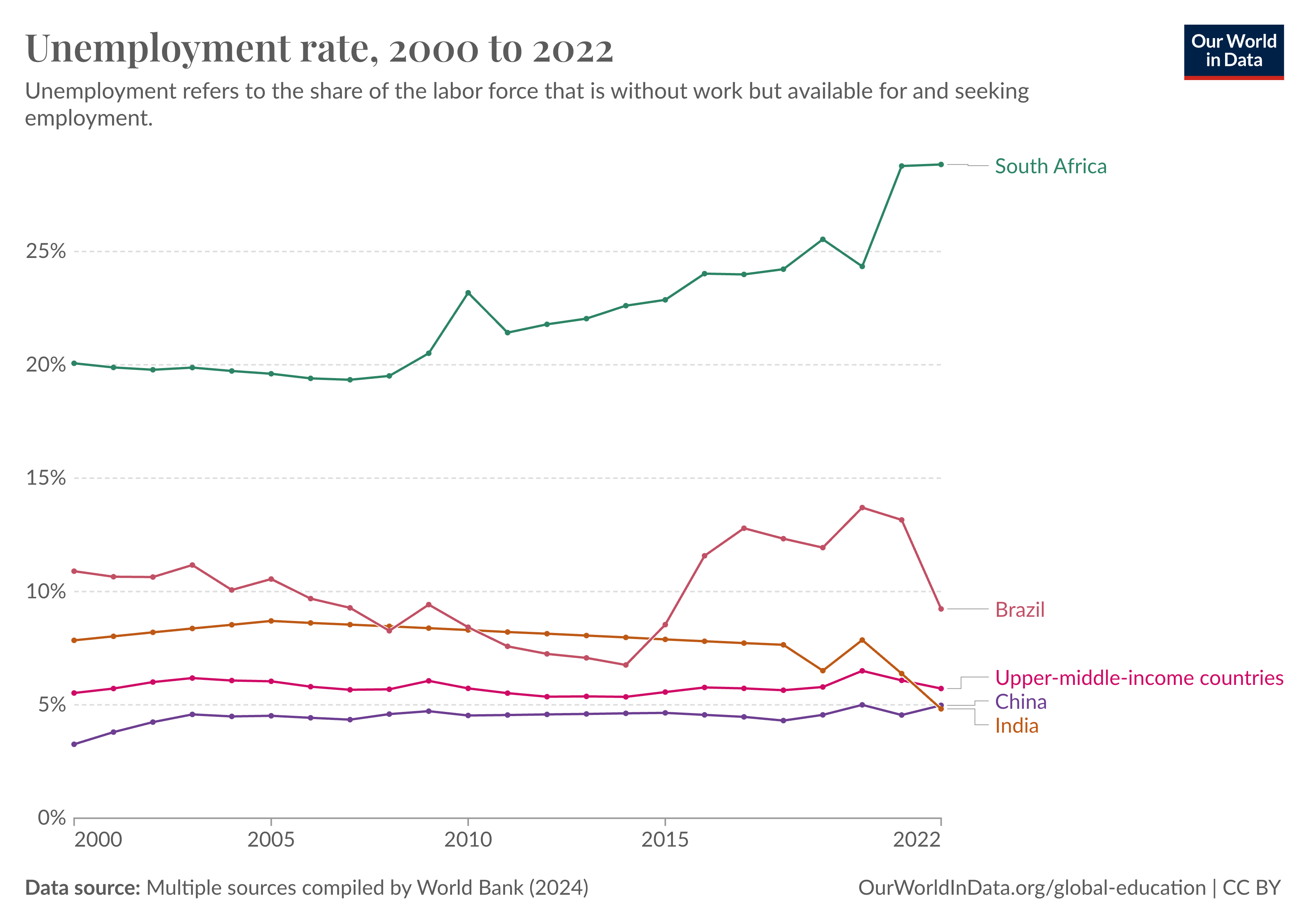
Sometimes, this was something I should have known, like the severity of the unemployment hitting South Africa:
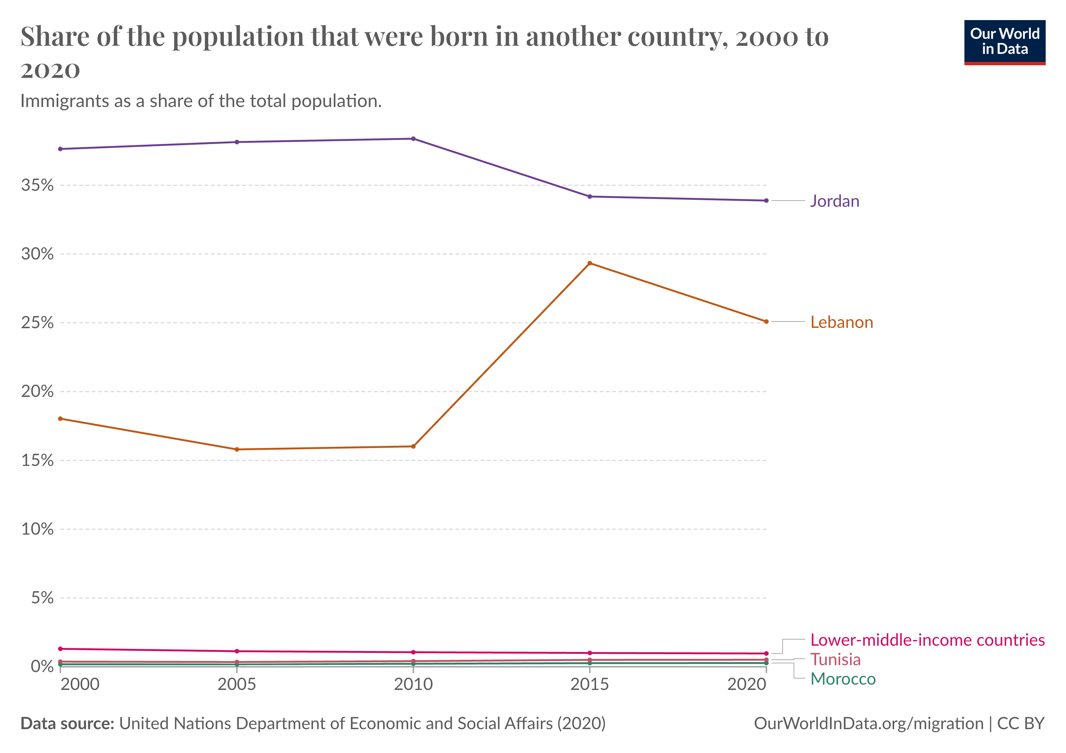
Or the extent to which Syrian migrants had fled to Lebanon following the civil war.
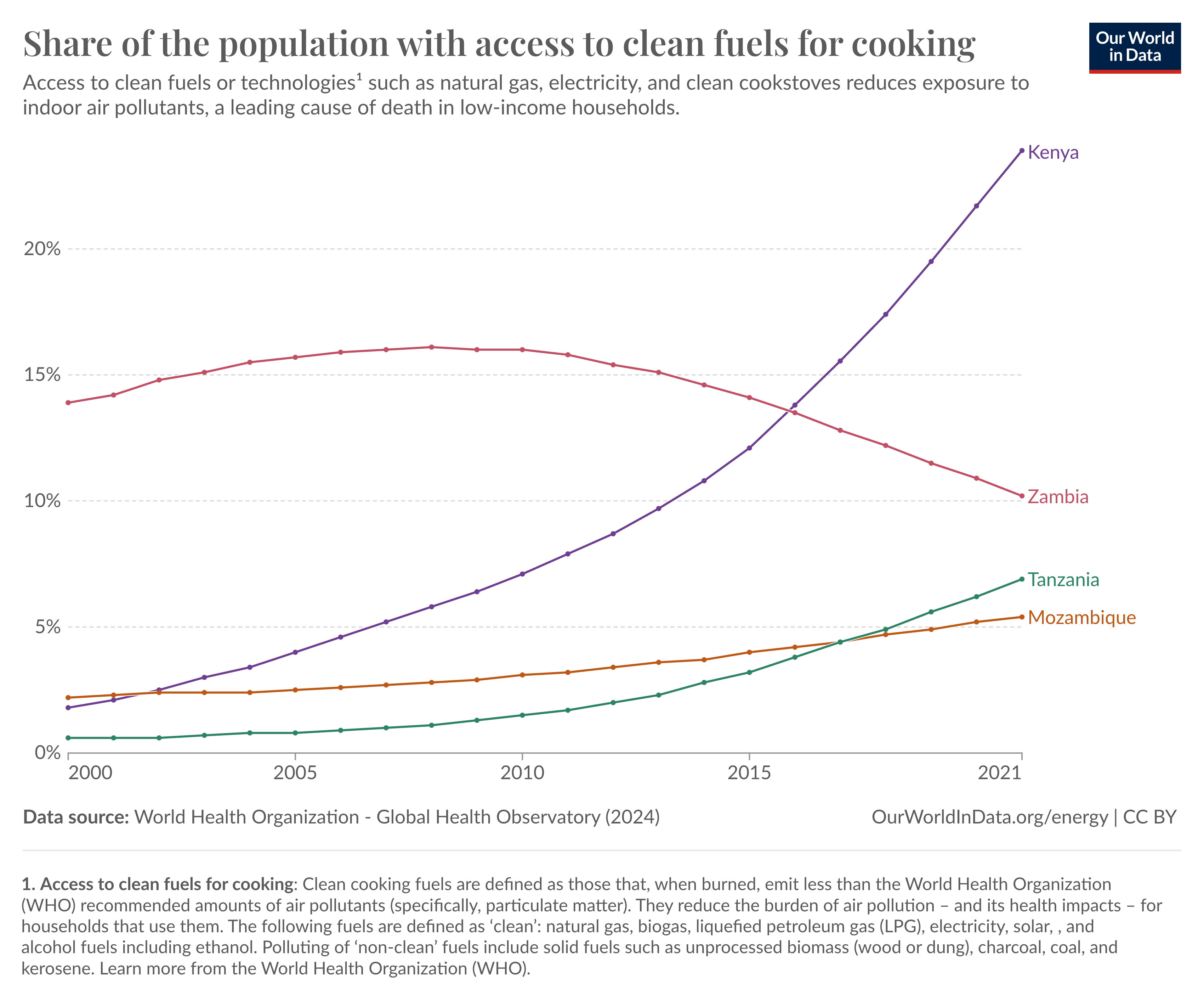
I also stumbled upon lesser known issues. For example, looking at Mozambique I became struck by the major successes in Kenya and declines in Zambia’s use of clean cooking fuels, fuels allowing you to cook without breathing in smoke that causes lung disease. Often you are left wondering what is happening in these countries to cause these changes.
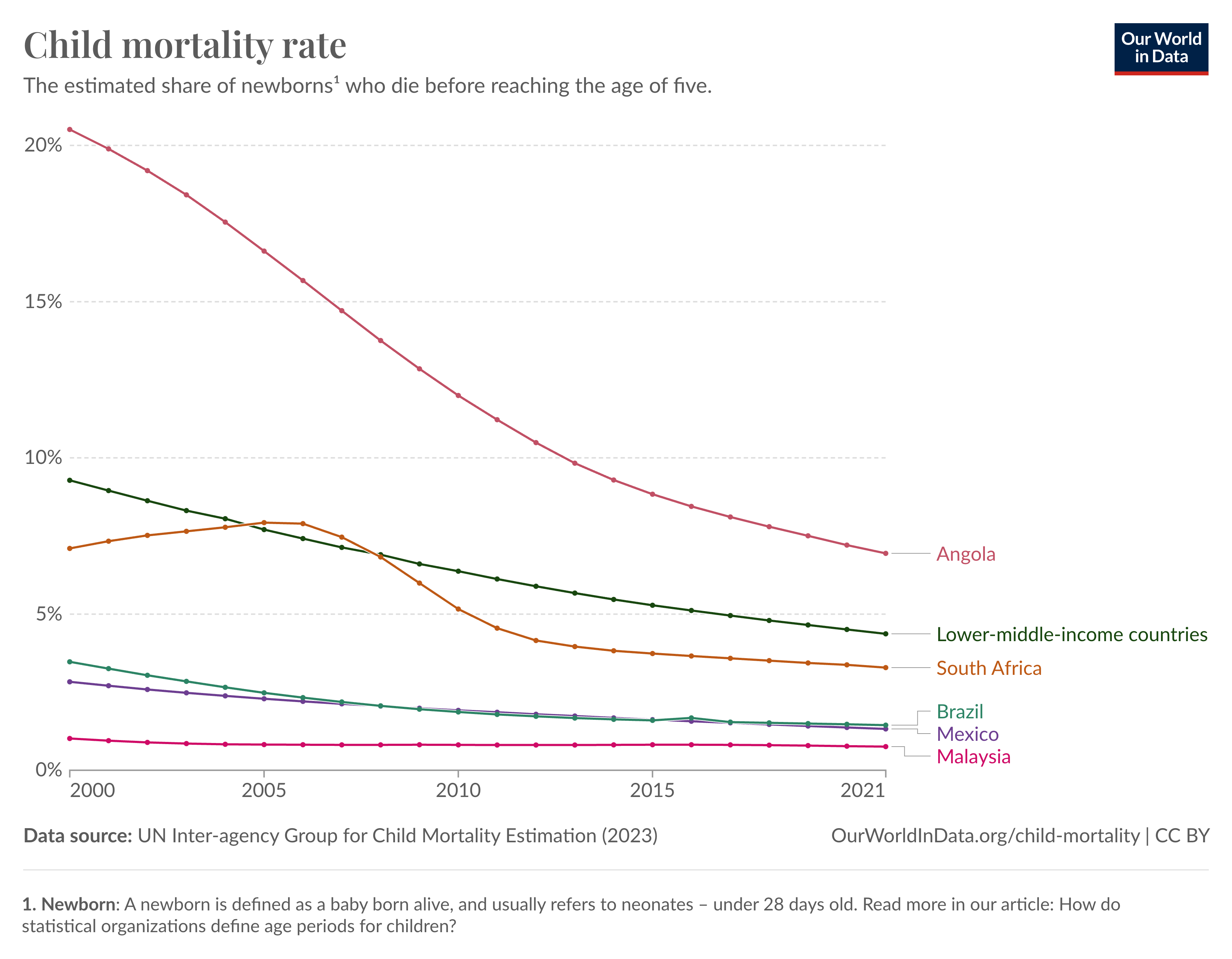
On the other hand, some charts always showed the same thing. Even a country with a volatile economy like Angola has had substantial reductions in child mortality over the past two decades. It’s a positive trend repeated across the world.
As a whole, it’s impossible to look at countries this way and not be struck by how far we still have to come in providing basic services to everyone. But likewise it demonstrates how much progress has already been made, even in the past two decades, to improve the lives of billions of people.
Explore for yourself
I invite you to have a try, look at your own country, and press the shuffle button a few times to look at countries far from your own. I hope you find it as interesting as I did.
Footnotes
-
I’m acutely aware that a high GDP per capita might not capture flourishing, but a low GDP per capita certainly captures poverty, and that’s good enough reason to use it as a starting point. ↩
-
When looking at CO2 emissions per capita, richer countries emit the most, so they’re important context when looking at less wealthy nations. ↩